Blog archive June 2007
30.06.07 / 01 / moscow again
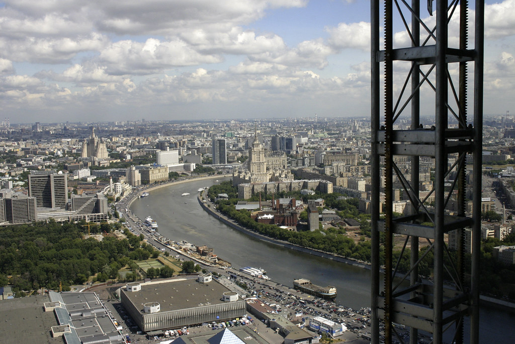
the sunshine, the greenery and the long hours of daylight make moscow a much nicer place in summer. moscow has a severe hotel shortage, the prices are exorbitant whenever something is happening in town [and there is always something happening], so we rented an apartment just south of the centre, overlooking ploshchad gagarini and about fifteen minutes drive from federation tower. it worked out very well, there was nothing you wouldn't have in a hotel apart from the absence of towels. the apartment was very hot, but the traffic noise was so great that you couldn't sleep with the windows open. great view though.

the problem of these trips is always the lack of sleep. we arrived mid-evening [having left london at lunchtime, due to the time difference]. by the time we had settled into the apartment and waited for our moscow business partner to show up it was past midnight. by the time we had eaten it was 1.30am and our partner was trying to persuade us to meet up with other business contacts. we dissuaded him with considerable difficulty, but for some reason he then wanted to walk back to the apartment, which took until 2.30am. and we had to be up at 7.30am for meetings starting at 9am! the problem is, we do two types of business when we're in russia - the kind that happens in meetings in offices at 9am, and the kind that happens in restaurants at 1am. they have incompatible timescales.
being professionals, we made it to the 9am start - and found that our items had been removed from the agenda for the day. it seems that the basebuild people running these meetings had failed to communicate with our people that the agenda had changed last week. so my trip was largely in vain since my colleagues could handle the rest of our business. we observed the meeting for as long as seemed courteous, until it became clear that we were wasting our time and left to pursue other matters.
but the evening was pleasant. we visited our partner's new offices at the back of the TASS building, went to a little soviet-era bar for a drink, then wandered through the nicer parts of town looking for somewhere to eat. somehow this took longer than it should and again we were eating at 1am in a swanky italian restaurant, waiting for a real estate contact to turn up. so four hours sleep again.
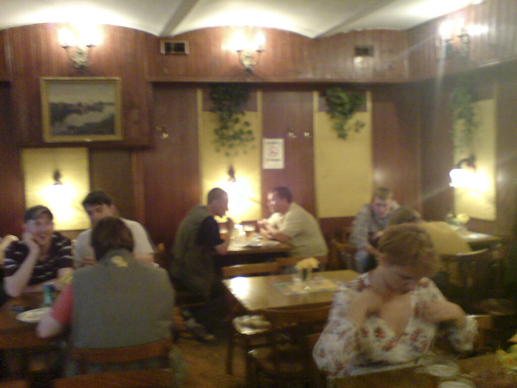
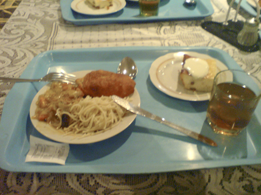
by contrast the next day we went for lunch at the soviet-style canteen next to the moscow city site. the photos don't capture the dingyness, the synthetic-ness, the unappetising smells, the glutinous stew. it was hilarious. 1960s school dinners. the drink looked like it had something decomposing in it, but it turned out to be dried fruit. the flypaper over the servery would get the place closed down anywhere else. it was cheap - about £2.50 for the meal. the turquoise trays destroy the appearance of any food - wonder where we can get them for the new building? ;) more seriously, this is the russian lunch culture - all sit down together for a cooked meal on a tray - which causes us problems in federation tower as there isn't the room to seat everyone at once. they don't go out for sandwiches or eat at their desks. this will be difficult to solve.
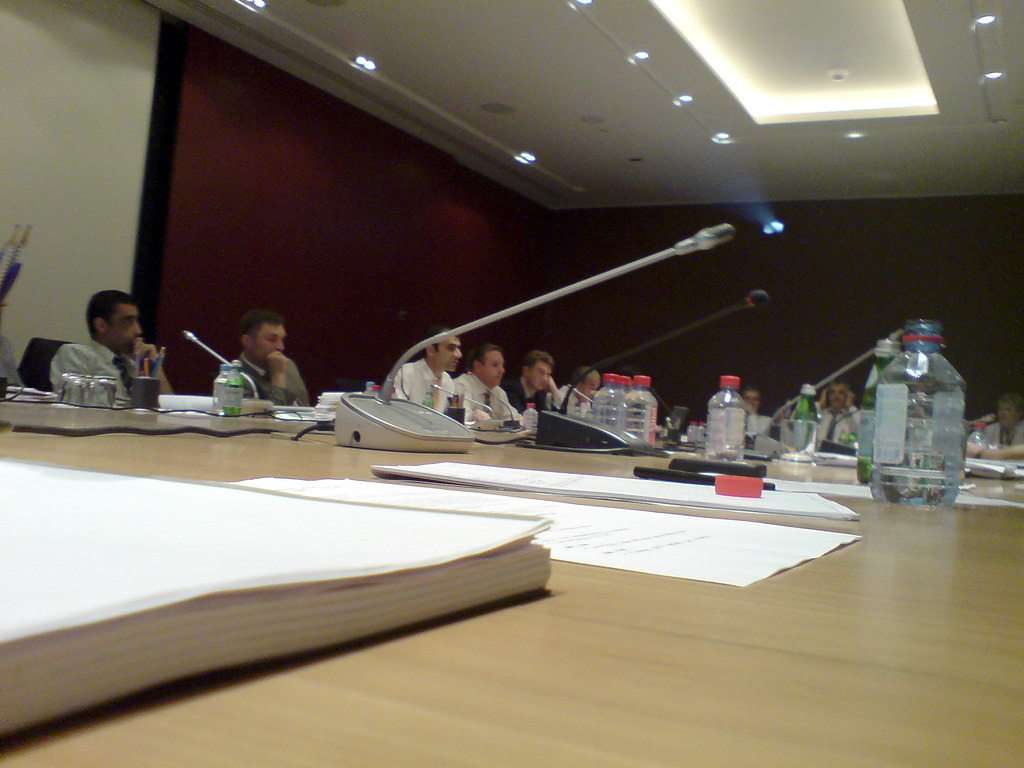
and then we went up to levels 57 and 58 - notionally to see the VTB signs, but we were mostly interested in the views. the contractor's lift that crawls up a track hanging off the face of the building is a little scary - ten floors is fine, when you're 50 floors up with nothing around you and 10 to go you are trying not to think about what happens if those little motors and cogs fail.
and then i headed for the airport to get the 9pm flight. all went well until heathrow. a gas leak had closed a runway earlier, and now a lot of flights were coming down at once. we were 20 minutes late landing. then we had to wait on the plane half an hour because there weren't enough staff to connect a gangway to the plane! then we had to wait three hours for our baggage - 1am in the baggage hall at terminal 1, stifling heat, crowds of angry people, three staff and no announcements - seemed like a complete failure of management. i had been up since 7.30am moscow time, so it was 4am by my body clock [after two nights of four hours sleep]. my luggage arrived just as i was thinking about going home without it and coming back the next day. i got home at 2.30am. i emailed the office to say i was sleeping in.
21.06.07 / 01 / london bridge station
this evening i was photographing london bridge station, before demolition begins in september for the shard. it's a typical late-brutalist transport interchange of a kind that's under threat everywhere at the moment. these big composite monsters were bold pieces of problem-solving at the time, replacing ill-assorted victorian clutter with facilities for the motor age. but now they're tired and leaking, and the architecture is unfashionable and little understood.
not every large concrete building of the 60s and 70s can properly be described as brutalist. true brutalism is an architecture of expressed circulation - walkways and stairs and lift shafts, 45 degree angles, irregular plans strung out along 'natural' circulation routes. consider the station tower, its Y-shaped wings ending in stair towers, or the bus station canopy stepping in and out to follow the bus route - by contrast to the square inexpressive lump of the guy's hospital tower behind.
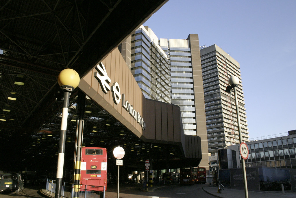
see also the southbank centre or nearby colechurch house. brutalism can be understood as an artifical landscape made of artificial rock - it doesn't present us with facades but with movement, and parts of the building individually expressed like boulders along a path.
16.06.07 / 01 / even more sore
... after the final session with harry at flamin' eight to complete the eclipse tattoo. photoset here.

the part that hurt most was the top end of the line at the base of my neck - not nice. after that was the line on my forearm, surprisingly - i was feeling it in my fingertips. it also hurts when harry goes back over freshly tattooed parts to perfect them. and then it's really sore afterwards on the way home.
the genesis of this tattoo is in the total solar eclipse of 11th august 1999. as a child in the late 60s i had an astronomy book which showed the paths of all the total eclipses to the end of the century. the 1999 eclipse was the only one that would be total in britain - the path just crossing the end of cornwall [the only one to cross britain in my lifetime - the previous one was 1927, the next will be 2081]. in 1969 1999 seemed a mythical date, far in the future, and i wondered if i would be in cornwall to see it. and i was - almost accidentally, i hadn't intended to go after warnings that cornwall would be booked out, but i went down on impulse anyway. it was strange and astonishing to stand on the headland at st ives, knowing that i was on the line in my childhood book. and it seemed to me that my life to that point had had the shape of an eclipse, from a sunny childhood through many dark years and up again, and that the eclipse closed the door on those years.
[pause to mop tattoo gunk leaking out of clingfilm on arm]
i thought of having a tattoo immediately, but i couldn't nail the design. meanwhile i did the labyrinth tattoo as a smallish try-out to see how i felt. on a second visit to st ives in 2002 i saw work by local artist sir terry frost which seemed to me full of suns and eclipses - this gave me my idiom, but frost died before i could ask him for a design ;) and it went through various half-finished forms until this spring when i decided i had to get it done.
obviously a key feature of the tattoo is the line from wrist to neck, which resembles the thick black eclipse-path on my childhood map. the one thing you can't see from the final photo is its starting point. above my wrist are some dark freckles which curiously i have had since the time of the astronomy book, 68 or 69. now they have a circle drawn round them to make a solar disk with sun-spots.

Comments:
very nice. been thinking about the one i want to get and how i should get it before i do the live show i'm working on (whenever that will be).
daniel miller
that means it will be visible during the live show [so the tattoo could be anywhere depending on what kind of live show it is ;)]. so the kind of tattoo is part of how you wish to present yourself [arachnids or flowers]?
steve
Hail to the Dark Arts of Kentish Town!
I am intrigued and will wait patiently under this thorn tree for the full significance of this to be made known.
nic paton
@Steve: forearm. Right arm is the only place I've ever considered getting inked. As for "before the show," only because the tattoo and the show are both concerning love.
As for arachnids or flowers: the latter, certainly...albeit singular. The former is a very intriguing idea, though. Will be considering both now.
daniel miller
given your love life the arachnid should be inside the flower ;)
steve
HA! True!
daniel miller
07.06.07 / 01 / fit for london?
pete davies of howies has just done this version of the 2012 logo [though he denies it]
now it strikes me that a logo that inspires so many creative variations is doing something right. my own feeling is that there's the germ of something good in the jagged shapes, but that it hasn't been resolved - the logo has the look of a half-finished idea published before it was ready. the shapes don't come together in a pleasing or immediately legible whole. the font is nasty. the colours are wrong. maybe they should have asked zaha hadid to finalise it. at the moment it's an embarrassment to a city with some of the best graphic design and branding talent in the world. i'm sure nic hughes would do them a logo [2012].
as for the epilepsy, i assume it's an intentional play on the word 'fit' ;)

Comments:
hm, brutalist should also be termed 'battlestar galacta-ist' .. i think i have always liked this particular style or influence, without knowing it's name, aside from being lumped in with modernism.
i am always drawn to hard geometry, almost as if something had crystallized out of the air, a protuberance from n-space or somesuch sci-fi concept.
perhaps i should lay off the ambient music and hard science fiction =D
keep us up to date on your building in moscow too!
tim westcott